Neighbourhood Scoreboards
Chalkboards depicting information on household energy consumption motivated end-users to conserve energy.
The Neighbourhood Scoreboard project tested the effect of public exposure of domestic energy consumption on residential end-users. The project was conducted from 2009 until 2010 by the Design Lab, University of Sydney.
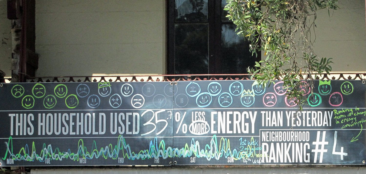
Five chalkboard displaying information on the household consumption were put up in a Sydney neighbourhood in autumn 2010 (Oct. – Nov.). Chalkboards, opposed to digital ones, were chosen because they were cheaper, more environmentally sustainable and visually attractive. The boards were manually updated every day and offered feedback on the electricity consumption compared to the previous day, a symbolic representation for each day of the current month, a graph representation for each week and a neighbourhood ranking that was updated daily.

Centrally placed on the scoreboard, the end-user could find information on how their consumption changed in comparison to the day before. Below, the board offered a graph visualisation of the weekly consumption pattern and the neighbourhood ranking. Above, the smiley faces represent a resume of the behaviour of the concerned household, evaluated not in comparison to the neighbourhood, but only in comparison the end-user’s own previous behaviour. This section could be personalised insofar that e.g. coloured flowers could be chosen instead of smiley faces. In general, the visualisations on the neighbourhood scoreboards depicted changes in behaviour rather than absolute consumption values.
The neighbourhood scoreboards offer an innovative and visually attractive example of creating social engagement in an energy context.
References:
Neighbourhood Scoreboards website
Download
Upcoming events
Supporters


